Tuesday 11 October 2016

My Mother is a Text-classification Algorithm

Some time ago, whilst having an extended discussion of the type of tiny bananas we were eating, my mother took out a scrapbook to see if she had kept any newspaper clippings on bananas. She had made these clippings in the 80s - before I was even born. The book fell naturally open at a page about tomatoes, which she had partially cancelled out, and had annotated the rest with these mysterious letters written into the margin... Why had she made these strange annotations? She really could not recall or explain to me why she had done this...


A closer reading reveals that what she has done is to cancel out the non-factual portions (ie: the story about how the grower was "thrilled" and all that) and then she has given each sentence a category?

LET ME DECODE IT FOR YOU
H refers to History of Tomatoes
T refers to Facts about Tomato Varieties
CT refers to Methods of Cooking Tomatoes
GK... I'm not sure but they are all about the flavour and acidity of Tomatoes

MY MOTHER IS A TEXT-CLASSIFICATION ALGORITHM!

I suppose I am really my mother's child...


#latergram: Post has been backdated to 11 Oct 2016 which is the date I first observed this phenomena

Monday 3 October 2016

That Black Box on Kensington Gore


I'm currently working on an "index" or documentation of 10 years of the Design Interactions Department (Royal College of Art) which I hope to finish soon (ie: before December). Much gratitude goes to Nina Pope who was the one who suggested it in the first place and allowed me to retrieve whatever flotsam and ephemera was left in the studio. I still have many people I want to write to and I confess that I originally meant to finish it by September, but it has taken me more time than expected and I am also now in Singapore working on other things. But since this is already coming after the graduation and there are no real deadlines except the one where I throw in the towel - I thought I should exercise due diligence, and do a little more digging into the wider history of design education as well as other courses which have since ceased to be, such as the Environmental Media course which was intrigued about some time back (but found not very much information about it online)...

I had never been to the Special Collections prior to this, nor was I particularly enthused about the College Library with its considerably short opening hours whilst I was studying (Imperial's library was very close by and I had access to it 24-hours). I suppose the thing is that I wanted a more general library at the time but the RCA Library collection does seem quite... idiosyncratic, as is likely to become the case with any modest-sized library of about 70,000+ books (in comparison with an extreme example, the British Library holds 170 million books). As a result, I've always felt that the RCA Library is more like a kind of place you wander into and encounter some pictures in an old book that you've never seen before - rather than a comprehensive place you could go to find any specific book in a university course reading list.

With the present difficulty of entering the college outside of term time without a pass (now becoming a real schlep with all the signing-ins, waiting to be collected, etc - despite ostensibly working on/for the college in some capacity!), I was determined to MAXIMISE MY LIBRARY EXPERIENCE! FIND ALL THE MATERIALS! SEE ALL THE BOOKS! And so scoured its lending shelves quite thoroughly for interesting, rare or antiquarian finds! (In this one respect, I recommend the very first section to the right on the ground floor. One usually might not think to go there as there are no books on the right wall which is the only wall you can see, but the left wall does hold what are probably some of the most expensive books which are hidden out of view. That one wall seems to be holding the bulk of the variously large and oversize books - where you will find gems such as an ORIGINAL 1904 edition of Haeckel's Kunstformen der Natur).

Never did I think that one day I would actually read a book about the Royal College of Art from the context of a former student looking at its history. Several years ago, when I first entertained the thought of further studies, I began copying the statements issued by universities and departments to potential students into my wiki. Don't laugh, but I was so serious about applying to RCA that I actually pasted a statement from the RCA prospectus onto the front page of my wiki: "The criteria for acceptance by the Royal College of Art are talent and potential, along with the commitment and the ambition to make a difference within an art or design discipline".

If this is the statement issued by the university to the student, then what is the equivalent of the statement issued by the monarch to the institution which seeks to be a royal university? I mean, what makes the college so "royal"? There is in fact the Royal Charter that the RCA received in 1967 which made it a university (which I must admit I had not read before):

Royal Charter: Our objectives are 'to advance learning, knowledge and professional competence particularly in the fields of fine arts, in the principles and practice of art and design in their relation to industrial and commercial processes and social developments and other subjects relating thereto, through teaching, research and collaboration with industry and commerce’.

Emphasis above is mine, but what is interesting is the repeated mention of industry and commerce in the charter. No such mention of industry and commerce is in the call to students, but I suppose the state of industry and commerce in the country is less the prerogative of the individual student and more that of those who are steering the college.

In former Rector Christopher Frayling's book on the History of the Royal College of Art, Frayling writes that "it was clear in late 1970s that college was becoming test-case pour encourager les autres" - with the Undersecretary for Higher Education threatening that it might receive "less recurrent grant" in the future if the RCA did not respond enough to National needs and priorities as per its Royal Charter. In Spring 1981 a visiting committee also reported that although the RCA may be "thriving", "it was neglecting its duty enshrined in Royal Charter" by not having enough links to industry and not making the revitalisation of the British economy its ultimate priority.

In a way I feel like the dissolution of avant-garde courses such as Environmental Media in the mid 1980s foreshadows that of the present day situation. Of course, these are two different situations, but the point to be made of both is that there has always posed a great difficulty in quantifying the value of art and design education. I suppose this is why a design school prospectus is always sure to have lists of graduates who have made it big in the industry or with their own commercial success stories or commercial companies. And an art school prospectus is going to write of the big international museums, fairs, and prestigious galleries their graduates have gone on to show and sell work at. How else do you quantify success? With significant HEFCE education funding cuts in the UK, the pressure is definitely on to "prove" that funding education is still a good investment.

For example, the strategic plan 2010-2016 by current Rector Paul Thompson stated outright a goal of "Expand(ing) the programme of Master’s courses to advance new developments in design and art, ensuring twenty-first century relevance". As to the metric used to determine the success of this particular goal, the intended outcome was to be "a 50% increase in student numbers to approximately 1,500 by October 2014; this will be caused by additional recruitment to existing courses, combined with recruitment to new courses that have been successfully validated". Strategic plan 2016-2021 envisions four new research centres and ten new postgraduate taught programmes and the student body will consequently have increased to between 2,300–3,000 by 2021. [You can read the strategic plans here on the list of RCA's Corporate Publications]

Personally I would have expected "increase in student body" to have been classed under "Finance" goals from the beginning - instead of under the goal of "Relevance"; it comes across a little disingenuous when phrased as such. Only 5 years away and an expected 200% increase in the student body from 2011? I really don't see how massive increases in student numbers will directly ensure twenty-first century relevance; it will instead increase the college's income from tuition fees and reduce its dependence on HEFCE funding - which is a perfectly legitimate goal for the college.

Also, I find it problematic when I see statements like "unified, customer-focused approach to the delivery of academic and operational services" and "value-for-money" bandied about. Is this how one must write or speak in order to be understood by funding bodies? But what happened to the human poetry of intellectual curiosity that should be the foremost driving factor behind art and design research excellence today? I'm not really comfortable seeing a document that is being disseminated to students and stakeholders entirely wrapped up in jargon that may not be universally understood.

And it is not just this issue of quantifying value, which we see when a document is expressed entirely in business jargon. To speak of terminologies, I suppose the bottom line of programmes like Environmental Media and Design Interactions was to some extent, an insistence on ambiguity. Ambiguity in its materiality in the former, and ambiguity through its materiality in the latter.

An account from Frayling's "The Royal College of Art: 150 Years of Art and Design": "One reason why conceptualism, minimalism and performance art never developed solid roots within the existing Fine Art schools was that from 1975 onwards, the Department of Environmental Media had been created to teach the more avant-garde students who were emerging from post-Coldstream painting, Sculpture, and Film courses. This catch-all Department started life as "the Light Transmission and Projection unit" under Bob Hyde, rather uneasily sharing studios with Hugh Casson's interior designers. But as the unit came of age - and in particular, as it proved to be more expensive than anticipated, with increasing use of video (or rather "time-based media") - no one seemed to be sure whether it had more in common with Stained Glass (coloured light) or Sculpture (spatial art)."

[...] "In which case," yelled the Glaswegian, "you're like a surrealist painter trying to paint a picture of someone trying to paint a picture of someone trying to paint a picture of someone trying to paint a picture... If you're not a dialectical materialist you're not in the picture at all." At that point he stormed out of the room, muttering about the secret police."

At Design Interactions, the goal as I understand it, was that tutors were trying to guide us towards the production of a work that might only be partially contextualised within our world, presenting itself ambiguously as a physical object from another world within our world, simultaneously juxtaposing multiple 'realities' but crucially never allowing total escape from remembering that we are still from our own reality. Doing so would allow the work to transcend plain commentary into something more uncanny? More perturbing? Something supposedly more effective in stimulating the audience into a deeper engagement with the work and issues at hand.

The issue of ambiguity lies not only in the reception of the work but also each individual artist/designer/technologist who produces the work. How confusing that must be for anyone working OUTSIDE of the discipline looking at it, especially if the confusion arises for those trying to determine an institutionalised metric for calculating the efficacy of the works. Equally confusing it must be for artists or designers with a more malleable 'voice' - it is certainly not for all. My issue with the production of works (particularly in the case of student works, if I may be honest) was that sometimes as an outside viewer I simply could not read what the designer/artist's intentions were. Whether a work is capable of concealing and revealing its position at the same time may be dependent entirely on the viewer's common knowledge and shared understandings with the producer of the work, so the onus would be entirely on the viewer whom the author has no control over. In a sense then, the work doesn't really end until you see what comes out from the other end (ie: the engagement of the viewer), leaving us with the problem of the black box that we have yet to unpack...

As this is getting quite long, I'm going to stop here for now and move on to... an anecdote about another black box!

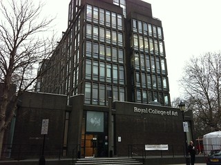
Why is the Royal College of Art black?


It never occurred to me to google for a picture of the architecture of the school until I first personally visited it for an open day, but knowing on paper that it was in the grand old Albertopolis area with a long history with the South Kensington Museum, I actually expected it to be less... harsh and BLACK. One might imagine that this was meant to make the building stand out in the area - however, it appears the truth is actually quite the opposite!
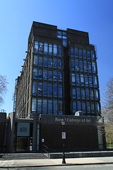
The Royal College of Art royal college of art The Royal College of Art

Images found on flickr by Chmee2, typeoneerror and Vicky Teinaki

The Darwin Building (Grade II listed) was designed in 1961, some years after the great Smog of 1952, which purportedly contributed to the demise of up to 4000 Londoners. This was also just before the Clean Air Acts of 1956 and 1968 banning black smoke emissions and requiring urban residents and factory operators to use smokeless fuels. Even in 1962 there was a significant fog which killed around 750 Londoners due to the extreme levels of pollution caused by black smoke (burning of coal, etc).

So in the 60s, the other buildings in the area such as the Albert Hall and the V&A Museum's terracotta design would have been covered in decades of thick black soot. Therefore, the RCA had been specially designed to have a "black brick and black concrete fondus" (both of which were rather expensive at the time) to suit the fabric of Albertopolis!

The entry on Historic England (the public body tasked with preserving and listing historic buildings/monuments) also makes this clear: "Reinforced concrete clad in dark red-brown brick intended to complement Norman Shaw's Albert Hall Mansions, then uncleaned, on the other flank of the Royal Albert Hall." In appearance, it is so dark as to appear black or grey from certain angles.

A couple years after its construction, London decided to clean up in the 1970s, perversely leaving the Darwin Building as the only outstanding sooty black building in Kensington Gore...

Sunday 2 October 2016

Pulau "Funtasy": The Maritime Dispute between Singapore and Indonesia that Wasn't

Perhaps this is old-hat news to all folks with their ears pressed to the ground here, but of late I haven't kept up with the news and I've only just heard of the story of Funtasy Island and its curious case of cartographic confusion which happened a few months back in June 2016.

A little sleuthing (actually just some common sense in extrapolating the possible file name of the previous map) resulted in this find:


Hold on to your flags, it's not a land grab, it's just a problematically coloured map produced by a marketing team!

So this was the map that started the misunderstanding...

"Funtasy Island" is described on its website as "328 hectares of pristine tropical islands" which "will be home to a limited number of villas carefully designed to sit harmoniously with the unspoiled natural environment". Formerly known as Pulau Manis, the Singapore-based developer, Funtasy Island Development (FID), had renamed it as as "Funtasy Island" when it recently unveiled its resort map to the world in June earlier this year. Located 16km from Singapore, its "artist impressions"/promotional pictures also depict a very visible Singapore Skyline in the distance and it is advertised as soon to be having a direct ferry service from Singapore.

Funtasy Island developers thought they were highlighting its proximity to Singapore by producing a map for marketing purposes which depicted the cluster of islands coloured in the same blue colour as Singapore, but the image went viral after first being covered in the Jakarta Post and the colouring was immediately interpreted by Indonesians as being Singapore's attempt to claim the island as Singapore territory, resulting in a knee-jerk reaction from Indonesian media and amongst Indonesian politicians.

Indonesian Army Personnel from Kodim (Dandim) 0316/Batam were even being dispatched to go down to plant the Indonesian flag on the islands, and a 'deeply puzzled' Ministry of Foreign Affairs in Singapore issued a statement:


Red. The Colour of the Indonesian Flag.
Now totally no one is going to mistake it for Singapore, that little red d- oh wait...

Certainly this belies the many sensitivities between Singapore and Indonesia and its other close neighbours, bubbling just beneath the surface. Perhaps for some it might have brought to mind the prolonged Ligitan and Sipadan dispute - when Indonesia and Malaysia had a territorial dispute over the Indonesia-Malaysia maritime boundary and the two islands - which the International Court of Justice (ICJ) later determined to be Malaysia territory. Or the case of Nipah Island, which has been one of the agreed basepoint for Indonesia's maritime border with Singapore - over the years millions of cubic metres of sand were dredged and sold to Singapore for its own reclamation works, eventually triggering Indonesia concerns about Nipah Island becoming submerged below sea level during high tide, prompting extensive reclamation work on the island in order to preserve it as the agreed basepoint for Indonesia's maritime border with Singapore.

The Treaty between the Republic of Indonesia and the Republic of Singapore Relating to the Delimitation of the Territorial Seas of the Two Countries in the Eastern Part of the Strait of Singapore was signed again for the second time in 2014 - extending the part of the line that has been previously agreed upon - but so far only some portions of the maritime border between Singapore and Indonesia has been defined and agreed on. Apparently some of the remaining parts yet to be determined may also require Malaysia's involvement - since at some point Singapore's waters do meet with both Malaysia's and Indonesia's!

Despite its technical trickiness, surely the only outcome desired by both Singapore and Indonesia would be a peaceful agreement that would be in the mutual interest of both countries. So people, be careful with how and what you map! For as it has been proven, it's not all fun and fantasy, these maps wield power...


Image Source: Funtasyisland.com

Misunderstandings in the Model Dinosaur Park: Overheard in Crystal Palace

Untitled

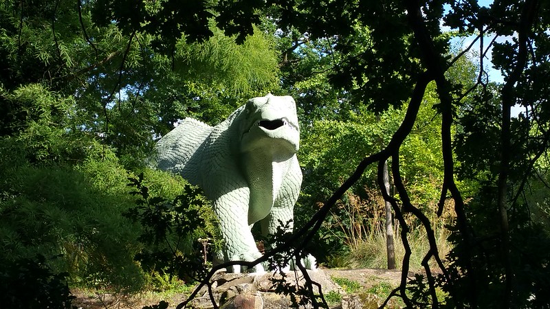
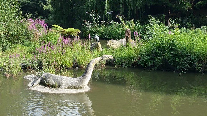
Ever since I saw that famous engraving of a dinner held inside the mould of the Iguanadon, I've wanted to see the Crystal Palace Dinosaurs in person. And so I went to see them some months ago! (Cripes, how time flies...)


Dinner in the Iguanadon on New Year's Eve 1853
Illustrated London News, 7 January 1854

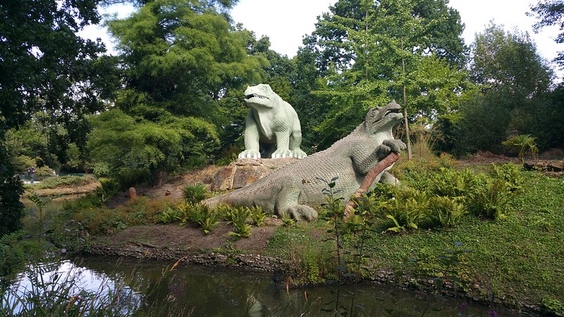
Today the Crystal Palace may no longer be standing on the top of the hill, but its dinosaurs still survive on!

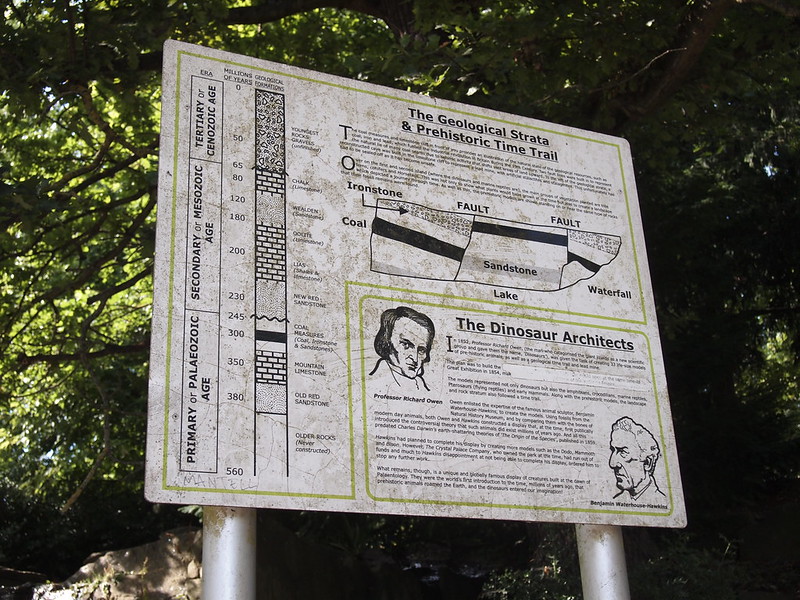
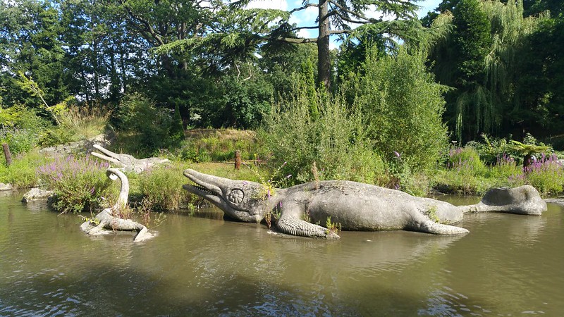
Directed by Richard Owen using the very latest scientific knowledge of the Victorian era, sculpted by Benjamin Waterhouse Hawkins and set in a rocky landscape designed by Joseph Paxton, the entire theme park was built between 1853 and 1855 (when Hawkins was told to stop work) and apparently looks more or less like it did back then, although I followed the audiotrail which takes you on a route in the opposite direction from which most Victorian visitors would have come by. These creatures underwent restoration between 2000-2003 and were upgraded from Grade II to Grade I listed after the restoration work.

Obviously over 150 years have passed since that day and our understanding and speculation on dinosaurs has changed a lot since then. It is also obvious that rivalries between scientists also added to their misshapen-ness. But their persisting interest to us today comes from them being one of the earliest known attempts to depict dinosaurs and other extinct animals - presenting these huge concrete reconstructions to the public in the form of this terrifying theme park and shaping early notions of dinosaurs in the collective imagination. Considering their size, the fact that these huge sculptures even managed to be completed was also quite a feat at that time.

Untitled

Untitled

Whilst walking around the park I could not help but overhear many curious statements uttered by visitors which made me worry that perhaps the people visiting the park were somehow too busy focusing on trying to get suntans or taking pictures and selfies with their handphones and not at all reading the many detailed informational signs around the park.

It is possible that some of them had even failed to understand the premise or context of these sculptures. Alas, I suppose the practical fact of the matter is that reading dusty noticeboards about prehistoric life and making educated speculations does not necessarily rank high on the priorities of everyone on a summer's day out. Which brings us to...


MISUNDERSTANDINGS IN THE MODEL DINOSAUR PARK!

Actual statements overheard on a trip to Crystal Palace on August 13, 2016

Untitled

"Ooh! Look at the snake! See that snake? Can you see the snake? Snake?"
said a grown woman to her pre-language stage toddler.

Untitled

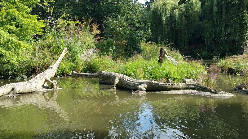
"Why is the crocodile's beak so long?"
asked a genuinely puzzled adult woman to her male companion.

Untitled

"Say what you like about these reptiles, they're the only ones still going!"
confidently said a grown man, to his young child and elderly father.


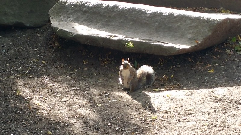
So... I'm going to end this with a picture of an angry squirrel that I also saw in the park. (It wanted nuts. I ran out of nuts.)

Untitled

PEDANTIC SQUIRREL: "IT'S A PARK OF SCULPTURES DEPICTING VICTORIAN MISUNDERSTANDINGS OF EXTINCT ANIMALS U DUM DUMS. EXTINCT!

VERDICT: Dinosaurs today - Still misunderstood

Saturday 1 October 2016

Parameters for a Windmill, Maritime Insurance, and A Trip to the Caird Library

HELLO WORLD! I've actually got several important announcements to make and projects to document here, but before I do that, FIRST OFF, today I am going to try to push online my entire backlog of half-written posts piled up from the last few months of my semi-digital-hermitage... all of my half-baked notes on various things of interest such as Funtasy Island, the Clothworkers Company, Crystal Palace Dinosaurs, Royal College of Art's Darwin Building, Boukaloids, etc... WILL I BE ABLE TO GET IT DONE? STAY TUNED!


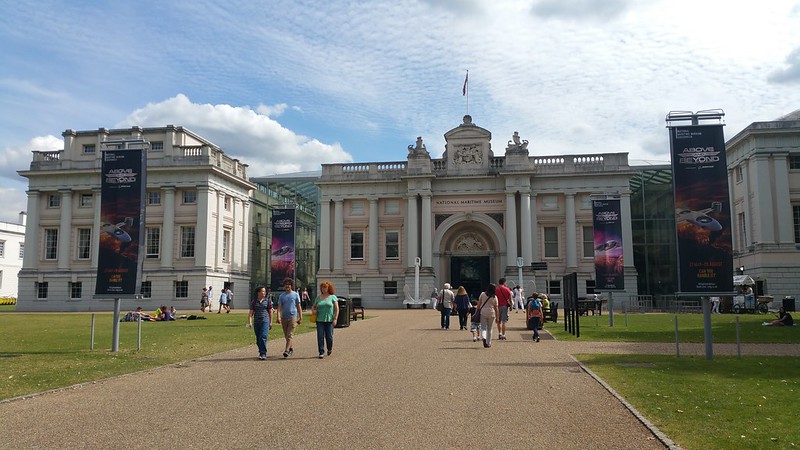
Caird Library, National Maritime Museum, London


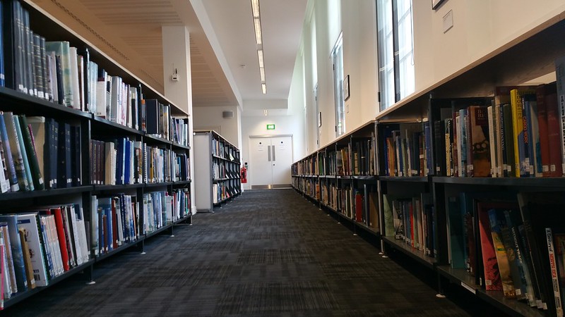
The Caird Library is located inside the National Maritime Museum. After being to many old libraries in London it was a little surprising to see the contemporary and modestly-sized Caird - despite being housed within a rather historic building. However, what's on shelf is only a small fraction of its collections - and the staff there are also incredibly helpful if you need help in locating resources!

Untitled

I was admittedly being unrealistic about what information I could actually find there - as ship logs and documents that survived long sea journeys were often only kept out of particular necessity. Furthermore the conditions at sea are in fact particularly unconducive to the preservation of information about cargo (esp since commanders and sailors often supplemented their paltry emoluments with smuggling and privateering). So instead I spent a fruitful afternoon (but quite different to how I imagined) reading up on the history of maritime insurance...

Untitled

At the time the name 'Lloyd' was neutral - very ordinary but not too commonplace and held no other associations or particular connotations of class, making it suitable as the name for a coffee house which turned into a business centre; information about the progress or fate of merchant ships and other maritime intelligence were ultimately obtained by overhearing the conversations and gossip of sailors who had returned. Early underwriters would have done their underwriting at the Exchange but then the merchants and underwriters alike would seek out news through the coffee houses where people gathered.

As Charles Wright and C. Ernest Fayle's "A History of Lloyds: 1689-1713" noted: "At no time, so far as we are aware, did any group of men say to each other, "Go to; let us make the greatest centre of insurance in the world!".


There were ample opportunities where fraud could be committed where the information upon which people made business decisions was entirely hearsay, and it is also written in 1728's The Case of the Coffeemen of London and Westminster (Or An Account of the Impositions and Abuses, Put Upon Them By the Present Set of News-writers), that the coffee men complained that the news-men would come to their coffee shops where "all sorts of rousing falsehoods" were uttered until they became news, and that the coffee shops effectively played a similar role in distributing news for free, whereas the news-writers were raking in money from advertisements.


The earliest surviving copy today is from Friday Jan 3 1740 (#560)

In response to the haphazard state of the news, the coffee men decided to utilise their position as the centre of shipping intelligence of the day and make their own news. This was years after the titular Lloyd (Edward Lloyd) had passed but the name Lloyd had already become . Lloyd's List - a public report published every friday and tuesday, gathering up all the scattered pieces of shipping intelligence - covering a gamut of events such as sinkings, disasters, abandonments, vessels spoken with, ships saved, damaged, fate of crews, lost cargo, mysterious floating objects, and from time to time, occasional extraordinary occurrences.

Example: random fragments from the year of 1834...

Brest 7 Jan 1834
A quantity of Canadian timber marked M.B & SW has been driven on shore on this coast.


Neath 12 Jan 1834
A considerable quantity of palm oil and a great number of hides have been washed on show at Newton with two lower masts and several other articles


Liverpool 31 Jan 1834
Charles Joseph saw a vessel bottom up, nearly new, bottom painted green.


Liverpool 31st March
Articles picked up: segarbox, dealboxes marked D545 & a quantity of segar washing about the rocks...


From May 2 1834
Singapore, 19th Dec

"The Baltic" sailed from Marietta for this port and has not since been heard of...


If this were to be a story about the changing modes of transmissions of shipping knowledge and intelligences, then one would also imagine that by today most of the above records (even historical records of shipping information) would all have been digitised; and this should not have required my pilgrimage all the way down to these physical repositories to read them...

Digital Sheds


Source: Wikipedia (Screenshot retrieved 02 Oct 2016)

And indeed I've also noticed that Wikipedia actually has an extremely detailed list of shipwrecks - even if you wanted to search about something as specific as 1834, there is a list of shipwrecks in 1834 which from a quick glance seems to be largely written by a very prolific wikipedia editor 'Mjroots' (who describes himself as someone with a hobby/interest in "molinology, deltiology, civil aircraft, railways and Dutch").

I've been fascinated by Mjroots' general sandbox - which is truly an amazing digital "junk shed-cum-workshop" of snippets. As so much of the text within seems to have been written to be the very example of a well-written wikipedia page, the Sandbox where the user Mjroots has collected all his half-written draft pages reads like a techno-poetic dream; an Infobox which tries to define all the possible parameters that might need to be known about a windmill; a Human-Markovian-wikipedia-daydream of lost ships, steam trains, windmills, tramway track maps and aircraft crash investigations...

Parameters for a Windmill
Source: Mjroots' General Sandbox

PS: I don't know you, Mjroots, but thanks for the hard work on wikipedia and all the lists of shipwrecks!